Welcome to the brand bible. Here you will find all the information you need to execute high quality, on-brand content.
The Springpod logo is the focal point of our brand. It is very important to use the logo properly so that the brand is represented correctly as shown in these guidelines.

In some cases (such as social media), it is better to use the 'rocket' on its own. This helps to reinforce the Springpod brand. In these cases, the guidelines below should be followed.

Please give the logo space to breathe, it helps maximise brand exposure. The minimum distance of clearance should be the height of the S of Springpod. This gives the logo prominence and ensures that it will not be obscured by other surrounding elements. The rocket on its own will use the same clearances as the logo.
Never reproduce the logo or the rocket at a size smaller than these recommendations, as it will result in the loss of their impact and readability.
The Springpod logo should never be smaller than 150px in digital or 40mm in print.
The rocket should never be smaller than 33px in digital or 12mm in print.
It is important that the appearance of the logo remains consistent. The logo should not be misinterpreted, modified, or added to. DO NOT alter the logo in any way. DO NOT rotate, warp, or disproportionately scale the logo. Its orientation, color and composition should remain as shown below—there are no exceptions.
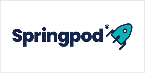
Springpod primary logo.
Springpod logo on a coloured background.
Springpod logo in Space Cadet on white.
Springpod logo in monotone white on black.
White logo with teal rocket is no longer allowed.
Using a different primary colour for the rocket.
Using another colour from the palette as a single colour logo.
Primary logo on a clashing colour background. Use all white in this case.
The rules for the logo are very similar for the rocket icon. Our brand should be consistent wherever it is used.

Springpod primary rocket.

Springpod rocket on a coloured background.

Springpod rocket in Space Cadet on white.

Springpod rocket in monotone white on black.

White rocket with coloured rocket is no longer allowed.

Using a different primary colour for the rocket.

Using another colour from the palette as a single colour rocket.

Primary rocket on a clashing colour background. Use all white.
Our brand colours are bold, diverse and accessible. To ensure our brand stays consistent, it is important to stick to these colours on any collateral.
Our primary colour palette has been created with web accessibility in mind. Our main brand colour is 'space cadet' with the supporting 'tiffany blue'. We then have our 'sizzling red' which is for use with anything related to students and schools, and the 'ultramarine blue' relating to universities and employers.

#16254C
R22 G37 B76
C100 M87 Y0 K58

#0BB3B7
R11 G179 B183
C91 M0 Y30 K0

#FF475A
R255 G71 B90
C0 M82 Y51 K0

#446DF6
R68 G109 B246
C80 M60 Y0 K0

#9CF6F6
R156 G246 B246
C38 M0 Y12 K0
Our secondary palette is used to support the primary for things like data visualisation. They help to provide a bit of vibrance to the brand and compliment the primary palette.

#49E9BE

#7F7EFF

#D81159

#FE9000

#FAC748
Greys are used for things like section backgrounds.

#2D3B5E

#5C6682

#8B92A6

#B9BEC9

#E9E9ED
Below are some examples of how to use the primary colour palette to maximise accessibility.
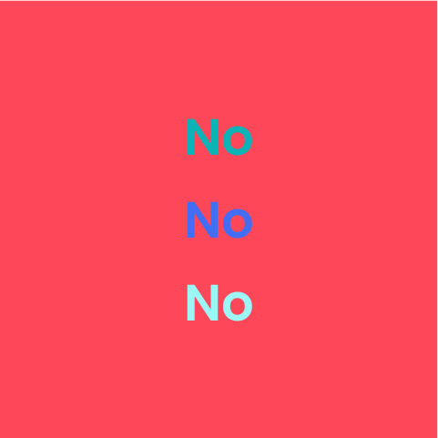
All primary colours can be used on 'Space cadet'.
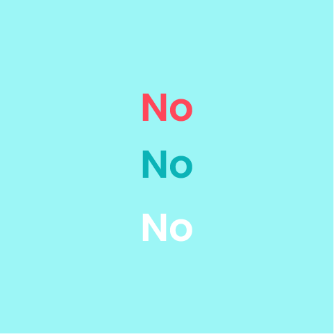
Only 'Space cadet' to be used on 'tiffany blue'.
White and 'Space cadet' on the red.
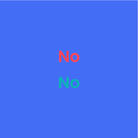
White, 'Space cadet' and 'Celeste' on the blue.
The type family for Springpod is Poppins.
Poppins Light
abcdefghijklmnopqrstuvwxyz
ABCDEFGHIJKLMNOPQRSTUVWXYZ
0123456789
Poppins Semi Bold
abcdefghijklmnopqrstuvwxyz
ABCDEFGHIJKLMNOPQRSTUVWXYZ
0123456789
Poppins Regular
abcdefghijklmnopqrstuvwxyz
ABCDEFGHIJKLMNOPQRSTUVWXYZ
0123456789
Poppins Bold
abcdefghijklmnopqrstuvwxyz
ABCDEFGHIJKLMNOPQRSTUVWXYZ
0123456789
If there is a case where Poppins cannot be used, please use Helvetica.
Icons are used to help people navigate sections of websites or documents. They are digital signposts, so they should be clear and easy to follow. Our icons are based on the material design icons from Google.
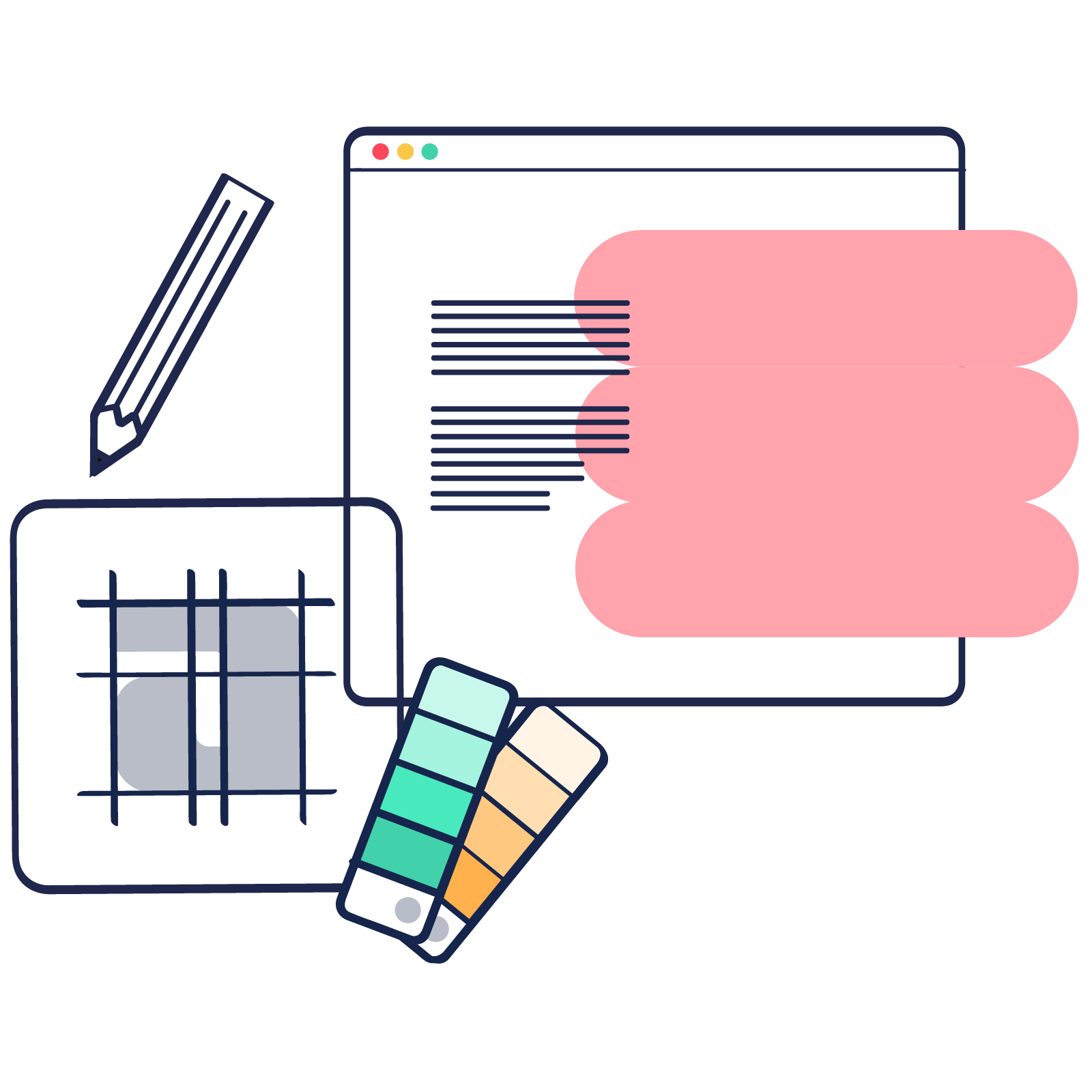
Illustration is at the heart of our brand. It allows us to re-create visuals that otherwise don't exist through photography. They are also unique to our brand.
Our illustration style is a collage of elements, which include photography, vector illustration, patterns, sketches and textures. You can see some examples below.


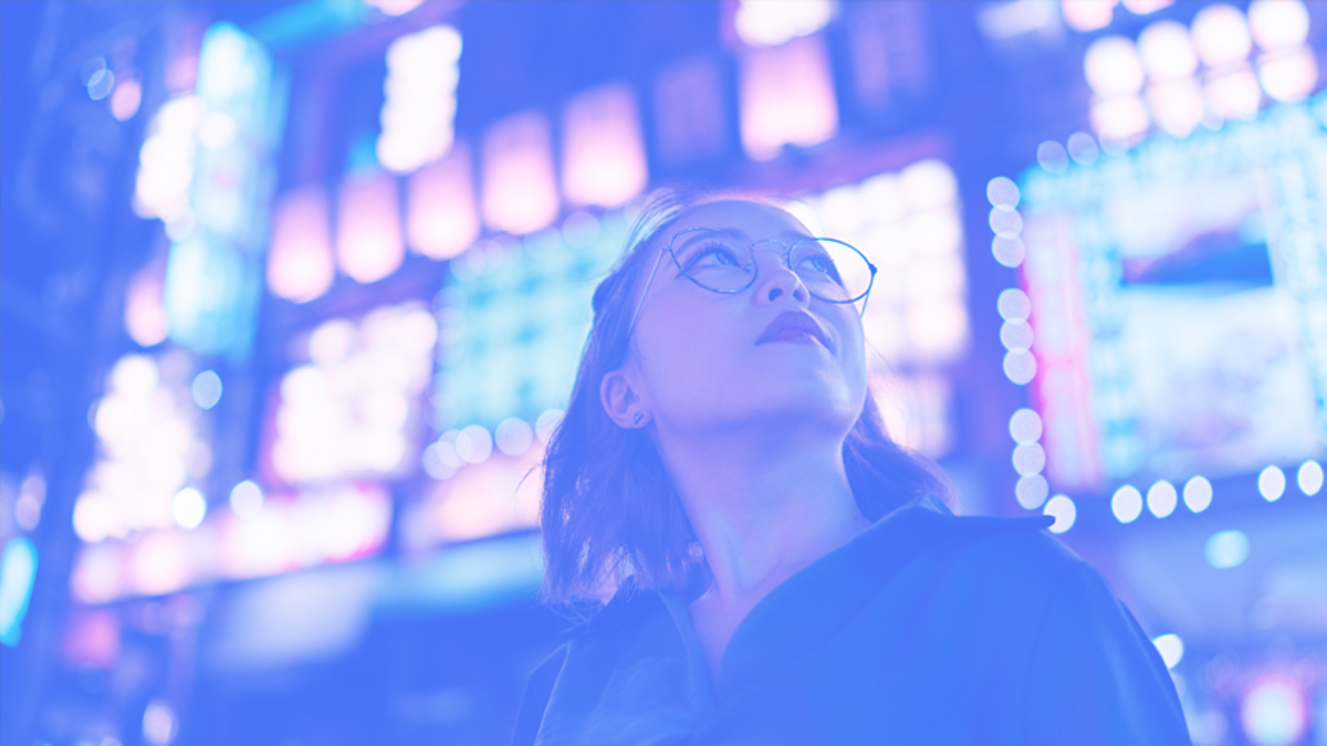
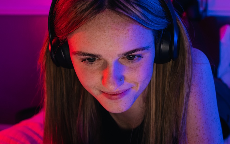
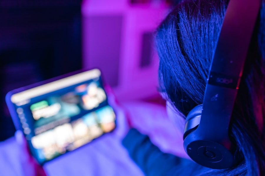
Springpod at its core, is about helping young people with their futures, so it is only right that we showcase this in our photography.
Our photography should feel focussed, inspired, and feature our target audience.
We prefer to use images from our brand shoot. If these aren’t available or suitable to the context, please use images featuring young people - and, where relevant, those using technology to access Springpod experiences. All imagery should feel positive and/or focused. See examples below.
Brand shoot examples:

Stock examples:
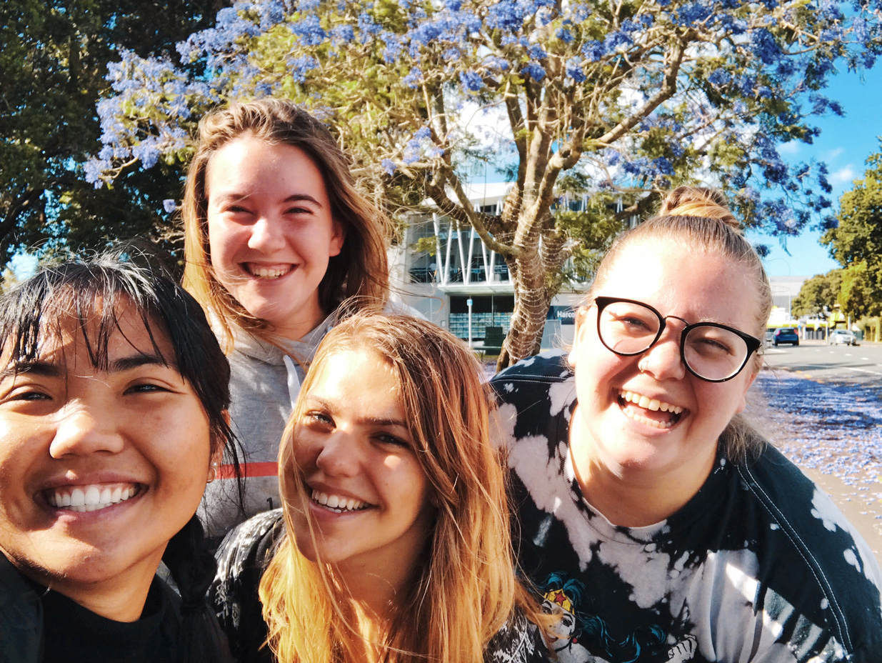


It’s important for every ethnicity, gender, and identity type to feel represented.
If you are unsure on which image to use, please view the image library linked below.